Design System Audit & Roadmap
A structured, actionable plan to take a broken Figma library from zero trust to full adoption — the first 30 days, Figma-to-code handoff, and documentation strategy.
Role
DS Manager Assignment
Format
Figma · Notion · Storybook
Scope
30-day roadmap · Token architecture · Docs strategy
Output
Audit framework · Implementation plan · Doc system
The Foundation
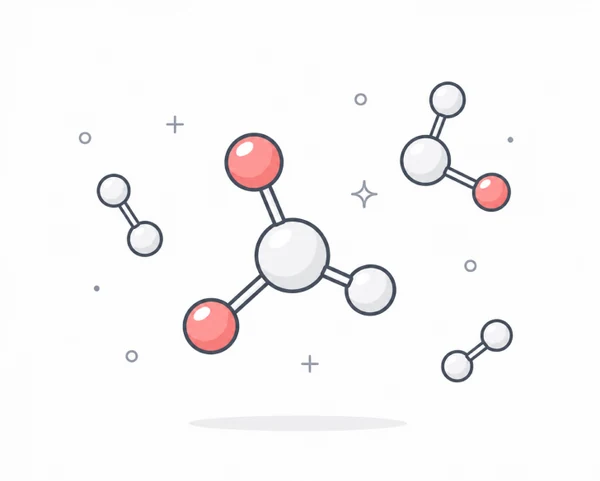
Atomic Design — not just a filing system
"Atomic Design isn't just a filing system — it's a shared mental model. When designers and engineers use the same vocabulary, handoffs shrink, reviews get faster, and contribution guidelines write themselves."

Atoms
Tokens · single button
Molecules
Search bar · form field

Organisms
Nav · data table · card grid

Templates
Dashboards · forms · pages
| Level | Contents | Audit focus |
|---|---|---|
| Foundations / Atoms | Tokens, typography, spacing, icons, single button, input — cannot be broken down further. This is where tokens live. | Token consistency |
| Molecules | Search field + button = search bar. Label + input + error = form field. Simple, testable, reusable. | Composition |
| Organisms | Navigation bar, data table with filters, card grid — what product designers compose directly in Figma. | Responsive behaviour |
| Templates / Pages | Dashboards, forms, empty states. Usage guidelines in Notion/Storybook, not live components. The system's handoff boundary. | Handoff boundary |
Atomic structure makes audits structural — scan atoms for token consistency, molecules for composition, organisms for responsive behaviour.
The Audit Approach
First 30 days — earn trust, then scale
The real problem isn't broken components — it's invisible ones.
Teams stop using a design system when they can't trust it. My first 30 days are about earning trust through quick, visible fixes — not a six-week audit report nobody reads. Rather than disappearing for a month and re-emerging with "v2," I fix P1 issues in the live library with a clear changelog and open a #design-system Slack channel.
Track 1
Figma Analytics + codebase scan
How many hard-coded hex values, raw spacing numbers, or inline font sizes exist? This reveals the true "token adoption gap."
Track 2
20-minute interviews
3–4 designers and 2 engineers. One question: "What's the one thing in the system that costs you the most time?" Listen for patterns, not feature requests.
Scoring
I score every issue against two axes: frequency and effort. High-frequency, low-effort issues become Week 3 fixes. Everything else gets sequenced. Critically, I map each issue to its Atomic level — fixing a token fixes every component that inherits it.
Token Architecture
Ship tokens before components
Three-tier architecture — from raw hex values to user-facing surfaces.
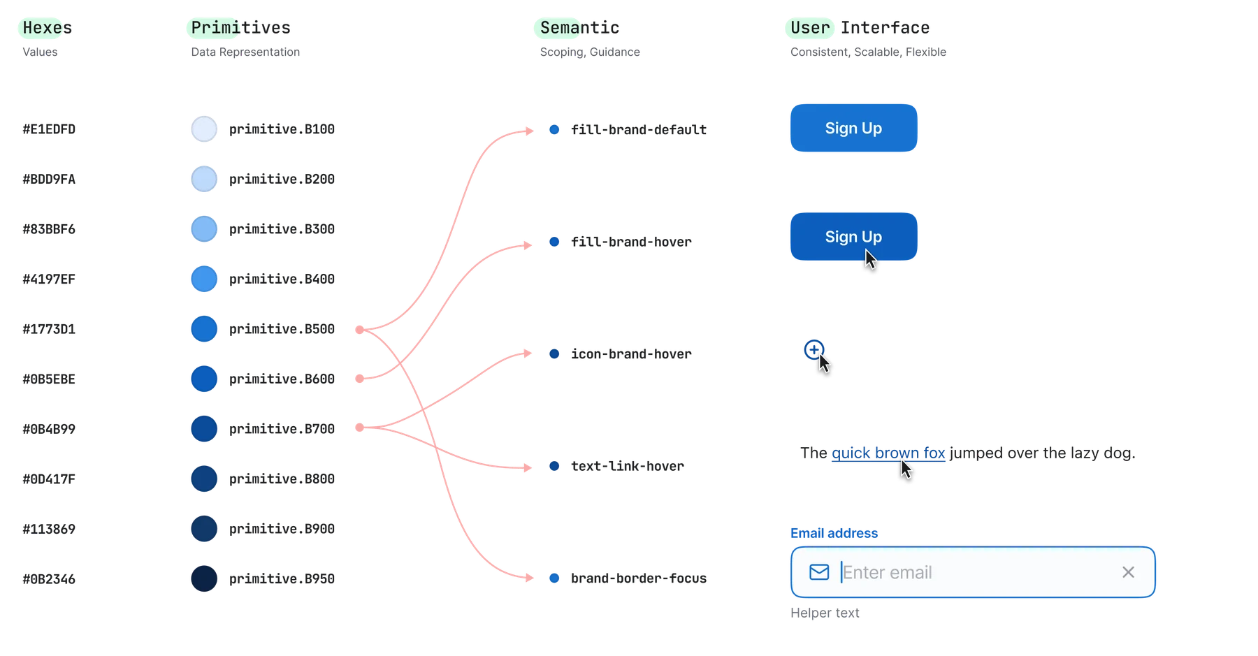
/* Primitive — raw values */
color.primitive.B500 = #1773D1

/* Semantic token layer — role-based */
color.semantic.surface.default → color.primitive.B500

/* Component token — purpose-specific */
color.component.button.bg.primary → color.semantic.surface.default

/* Output per platform */
CSS:    --ds-button-bg-primary: #1773D1;
Swift:  DSColor.buttonBgPrimary
I use two checks in parallel — (1) a visual QA session with a Figma frame and the live build side-by-side, and (2) a token audit script that confirms no hard-coded values remain. Run before every component is marked "stable."
Before "shipped" checklist
Documentation Strategy
Documentation that gets read
"Documentation fails when it's written for completeness, not for the person searching at 11 PM with a deadline."
Two reader types
Designer
"When do I use this?"
Engineer
"How do I build this?"
Three documentation layers
Foundations
Tokens, typography scale, colour system, spacing, motion. The "why" behind every visual decision.
Components
Anatomy, states, usage do/don't, props/variants, a11y notes, code snippet. Each page declares its Atomic level.
Patterns
"Use a ghost button when the action is secondary to the primary CTA" — not "A ghost button has a transparent background." Every rule has a rationale.
Dual-tool approach
Notion
Decision logs, principles, visual usage — the "why" layer Storybook can't carry.
Storybook
Live stories, component props, interactive states.
A Storybook page links to Notion rationale. A Notion page links to the live Storybook story.
Quality gates
A component without documentation is not “stable” — it's “beta.” No exceptions.
Quarterly doc review sprint: one-click “Flag as outdated” link → Jira ticket. Teams stay engaged when they see their flags get resolved.
Proof
Applied at CYGNVS
I've shipped this end-to-end — not as a consultant, but as the sole designer owning a cross-platform design system in a high-stakes cybersecurity SaaS product.
60+
Components
180+
Semantic tokens
3
Platforms — Web + iOS + Android
Live
Shipped in production
Want to see how this applies to your system?
Happy to walk through the audit framework, token architecture, or documentation model in detail — and to talk through how this would apply to your library.